Power Apps – Circular Progress Bar
7 steps
Introduction:
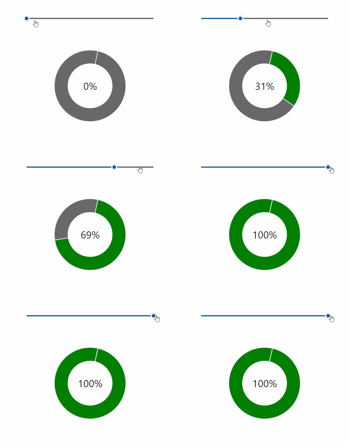
We will learn how to create a circular progress “bar” using out-of-the box tools in canvas apps. In this tutorial, we will use a slider to demonstrate that the progress bar updates when the target percentage is changed.

Step 1:
Insert a slider (modern) named Slider1. Change the following properties:
Max property
100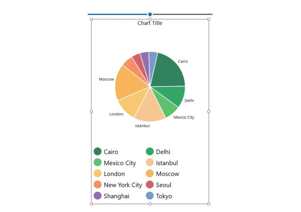
Step 2:
Insert a pie chart. You should see a pie chart with sample data in it.
Step 3:
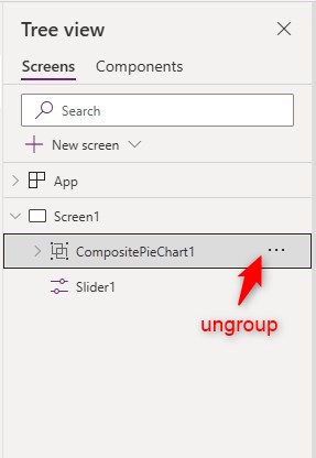
In tree view, ungroup the group named CompositePieChart1. The group should disappear and the 3 controls should now be separate from each other.
Step 4:
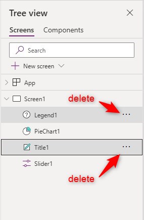
Delete the controls named Legend1 and Title1. PieChart1 should remain.
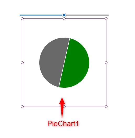
Step 5:
Select PieChart1. Change the following properties:
Items property
[
{Title:"Progress",Value:Slider1.Value},{Title:"Total",Value:Slider1.Max - Slider1.Value}
]
ItemColorSet property
[Color.Green,Color.DimGrey]ShowLabels property
falseItemBorderThickness property (optional)
0
Step 6:
Insert a circle (shape) named Circle1. Place it in the center of the pie chart and resize it so that it appears to be like a donut with a big hole in the middle. Change the following properties:
Fill property
Color.White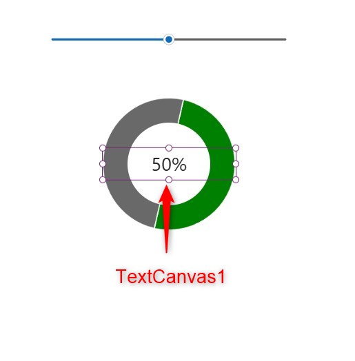
Step 7:
Insert a text (modern control) named TextCanvas1 and place it inside the donut hole. Change the following properties:
Text property
Slider1.Value & "%"Align property
'TextCanvas.Align'.CenterNote: Adjust font size as needed

Conclusion:
To test it out, activate play mode. Move the handle of the slider. You will notice the progress bar updates as you move the slider. You may change the slider into a value that you use in your app.
Did this article help? Let us know how we can improve. Send us a message by clicking the “Contact Us” button below.
[ratingwidget]Article last updated on July 9, 2024
Need expert guidance on Power Apps?
