Power Apps – Comment Section
13 steps
Overview
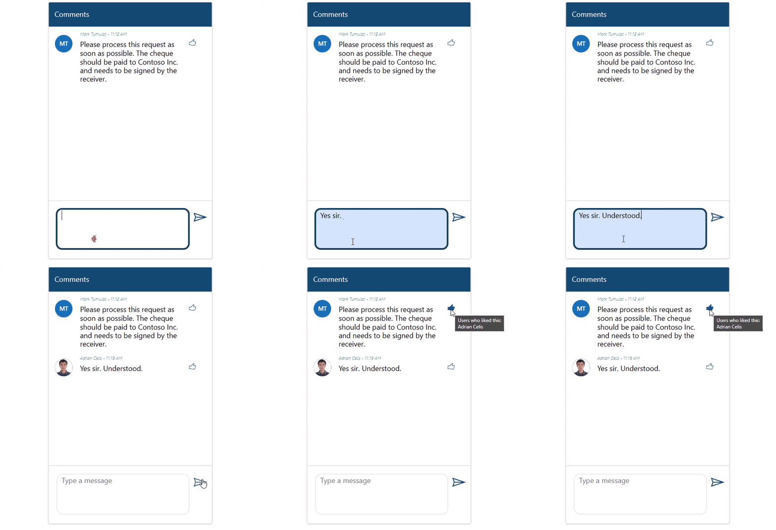
This blueprint will show you how to create a simple chat or comment section inside your Power App.
This is a demonstration of a concept of a chat or comment section where Power Apps does not have an out-of-the-box control for this feature as of writing. This can be useful if you want a comment trail for each of your transactional items.
Step 1: Main Container
Step 1:
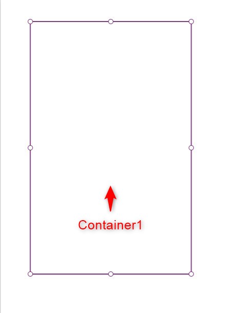
Insert a container and name it Container1. Make it a rectangular shape with its height about two times its width. Change the following properties:
BorderColor property
RGBA(214, 221, 224, 1)BorderThickness property
1Step 2: Header
Step 2:
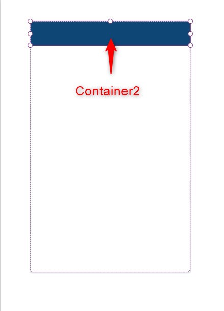
Insert a container inside Container1 and name it Container2. Make it rectangular in shape and place it on top as shown in the picture. Change the following properties:
Fill property
RGBA(14, 71, 117,1)Step 3: Header Label
Step 3:
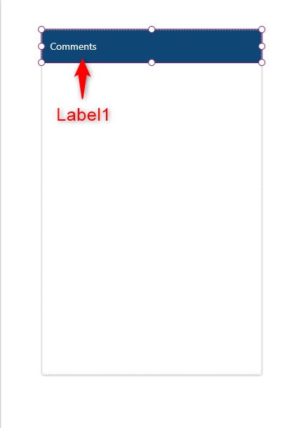
Insert a label inside Container2 and name it Label1. Make its length and width the same as the whole container. Change the following properties:
Text property
"Comments"Color property
RGBA(255, 255, 255, 1)PaddingLeft property
15Step 4: Comment Gallery

Step 4:
Insert a blank flexible height gallery inside Container1 and name it Gallery1. Place it just below Container2. Adjust its height so that you will leave a space below the gallery as shown in the picture. We will leave the gallery as is for now.
Step 5: Chat input container
Step 5:
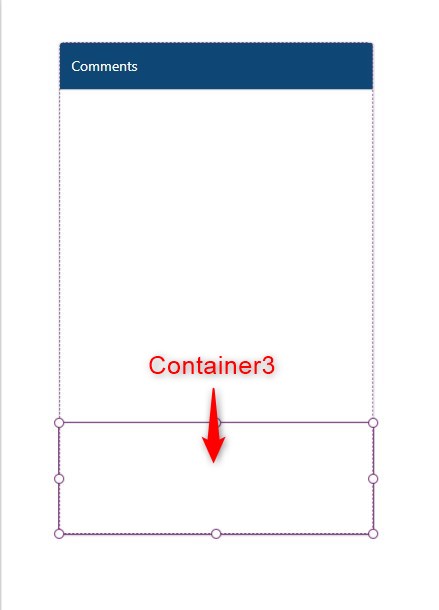
Insert a container inside Container1 and name it Container3. Place it under Gallery1 and fill up the remaining space of the container as shown in the picture. Change the following properties:
BorderColor property
RGBA(214, 221, 224, 1)BorderThickness property
1Step 6: Chat Text Box
Step 6:
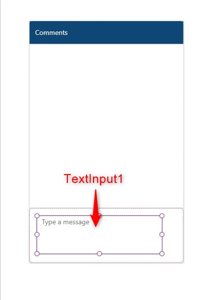
Insert a text input inside Container3 and name it TextInput1. Make its height taller as we will make this into something like a text area. Change the following properties:
Default property
""BorderColor property
RGBA(214, 221, 224, 1)HintText property
"Type a message"Mode property
TextMode.MultiLineBorderRadius (RadiusBottomLeft, RadiusBottomRight, RadiusTopLeft, RadiusTopRight) property
15Step 7: Send Icon
Step 7:
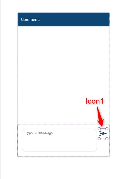
Insert an icon (Send) inside Container3 and name it Icon1. Change the following properties:
Icon property
Icon.SendOnSelect property
If(!IsBlank(TextInput1.Text),
Collect(colComments,
    {
        ID:GUID(),/*You may use the ID column of your data source*/
        CommenterDisplayName:User().FullName,
        CommenterEmail:User().Email,
        Comment:TextInput1.Text,CreatedOn:Now()
    });
Reset(TextInput1);
Reset(Gallery1);
);
Step 8: Chat Display

Step 8:
Let’s go back to our gallery. Select Gallery1. Change the following properties:
Items property
colCommentsDefault property
Last(colComments)TemplateSize property
100Step 9: Connect to Office 365 Users
Step 9:
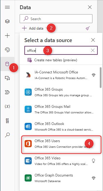
We will add the Office 365 Users connector to get user’s photos. Follow these steps:
- Click the ‘Data’ tab on the left-side pane.
- Click ‘Add data’
- Search for ‘Office’ in the search box
- Select ‘Office 365 Users’
The ‘Office 365 Users’ connector should now be added to the ‘Data’ pane. This is needed for the next step.
Step 10: User Photo

Step 10:
Insert an avatar (modern) control inside Gallery1 and name it Avatar1. Change the following properties:
Badge property
'Avatar.Badge'.NoneImage property
Office365Users.UserPhoto(ThisItem.CommenterEmail)Name property
ThisItem.CommenterDisplayNameStep 11: Sender name label

Step 11:
Insert a label inside Gallery1 and name it Label2. Change the following properties:
Text property
ThisItem.CommenterDisplayName & " - " &

Text(ThisItem.CreatedOn,
If(DateValue(ThisItem.CreatedOn) = Today(),
"hh:mm AM/PM","mm/dd/yy hh:mm AM/PM"
))
Color property
RGBA(33, 125, 123, 1)FontWeight property
FontWeight.LighterItalic property
trueSize property
8Step 12: Comment label
Step 12:
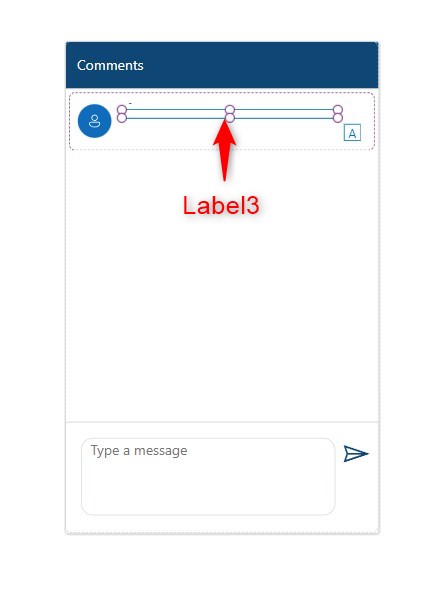
Insert a label inside Gallery1 and name it Label3. Place it just below Label2. Change the following properties:
Text property
ThisItem.CommentAutoHeight property
trueSize property
13Step 13: Thumbs up icon
Step 13:
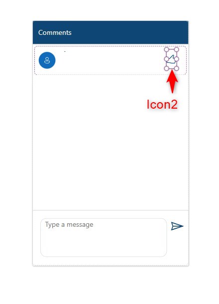
Insert an icon (thumbs up) inside Gallery1 and name it Icon2. Change the following properties:
OnSelect property
Collect(colReactions,{
CommentID:ThisItem.ID,
ReactorDisplayName:User().FullName,
ReactorEmail:User().Email
});
Icon property
If(IsBlank(LookUp(colReactions,CommentID=ThisItem.ID)),
Icon.ThumbsUp,Icon.ThumbsUpFilled)
DisplayMode property
If(IsBlank(LookUp(colReactions,CommentID=ThisItem.ID And ReactorEmail=User().Email)),
DisplayMode.Edit,DisplayMode.Disabled)
DisabledColor property
RGBA(15, 84, 140, 1)Tooltip property
If(Self.Icon=Icon.ThumbsUpFilled,
"Users who liked this:" & Char(10) & Concat(Filter(colReactions,CommentID=ThisItem.ID),
ReactorDisplayName,Char(10))
)
Step 14: Reset Button
Step 14:
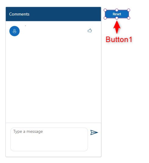
Let’s put a reset button only for testing purposes. Insert a button and name it Button1. Change the following properties:
Text property
"Reset"OnSelect property
Clear(colComments);
Clear(colReactions);
Conclusion

Conclusion:
To test it out, hit play mode. Type a message in the message box, then click the send icon. You should see that your comment goes into the chat display.
You may click the thumbs up icon to ‘like’ your own comment and if you hover over the icon, you will see the tooltip saying that you have liked the comment.
Press the reset button to start all over again.
You may replace the collection into your data source if you want it to apply to your business apps. By using a data source, you are able to make a conversation with different users using this feature.
Happy low-coding…
Did this article help? Let us know how we can improve. Send us a message by clicking the “Contact Us” button below.
Article last updated on September 24, 2024
Need expert guidance on Power Apps?