Power Apps – How to create an accordion or a expandable gallery
7 steps
Introduction:
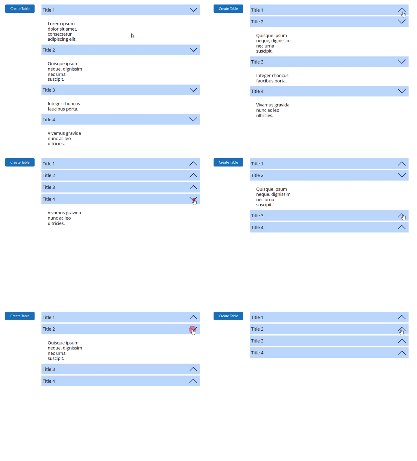
We will learn how to create an accordion out of a gallery. Follow these steps from scratch. After this tutorial, you have a basic accordion that you may customize from where you finished. Let us first create our sample data by using a button.
Step 1:
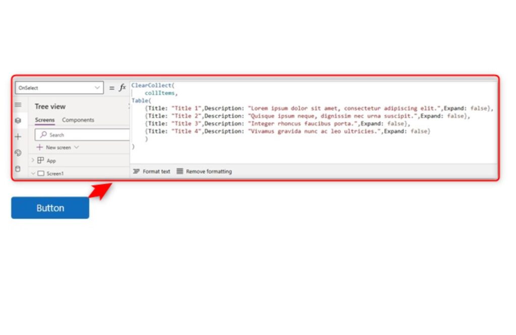
Insert a button to the canvas. Set the OnSelect property to
ClearCollect(
    collItems,
Table(
    {Title: "Title 1",
    Description: "Lorem ipsum dolor sit amet, consectetur adipiscing elit.",
    Expand: false},
    {Title: "Title 2",
    Description: "Quisque ipsum neque, dignissim nec urna suscipit.",
    Expand: false},
    {Title: "Title 3",
    Description: "Integer rhoncus faucibus porta.",
    Expand: false},
    {Title: "Title 4",
    Description: "Vivamus gravida nunc ac leo ultricies.",
    Expand: false}
    )
)
Step 2:
Click on the button as a user so that we will have our data/collection. For visual purposes, make the Text property of the button into:
"Create Table"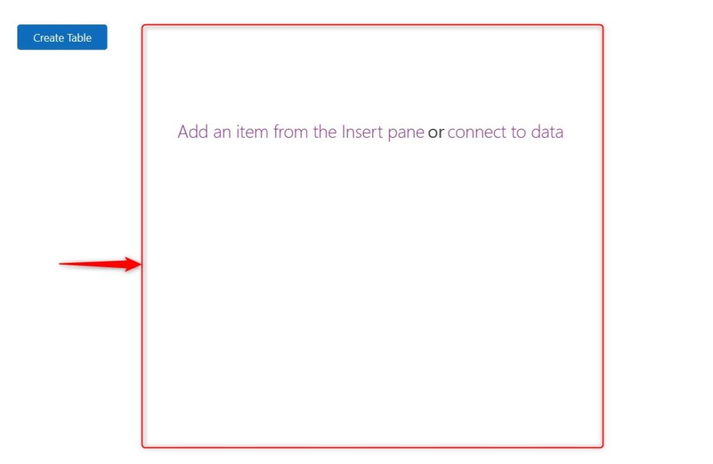
Step 3:
Insert a Blank Flexible Vertical Gallery. Make its Items property into:
collItems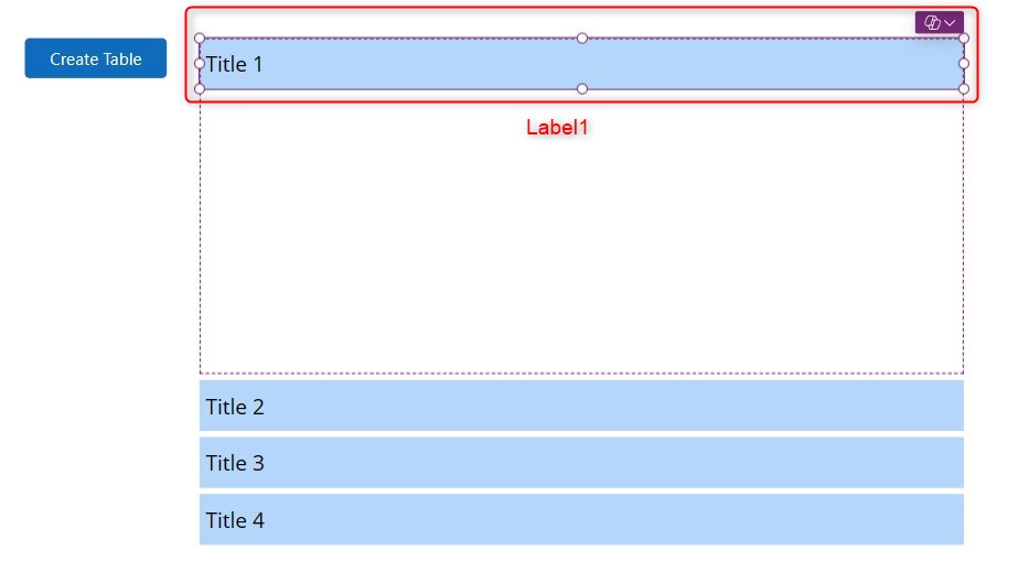
Step 4:
Insert a label named Label1 inside the gallery on the top edge. Make the background color light-blue. Make it’s Text property into:
ThisItem.Title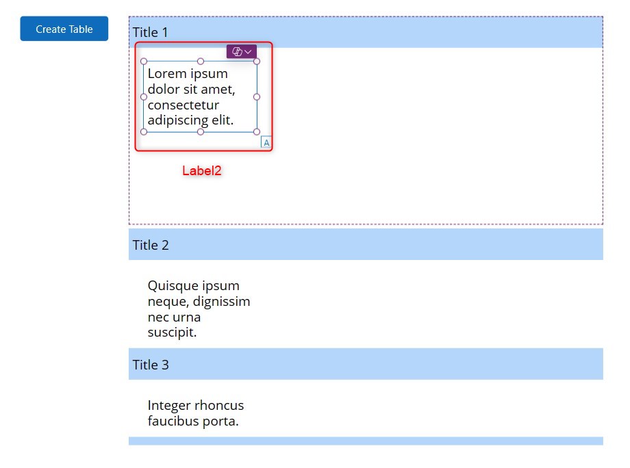
Step 5:
Insert another label named Label2 inside the gallery below the first label. Change the following properties:
AutoHeight property:
trueText property:
ThisItem.DescriptionVisible property:
ThisItem.Expand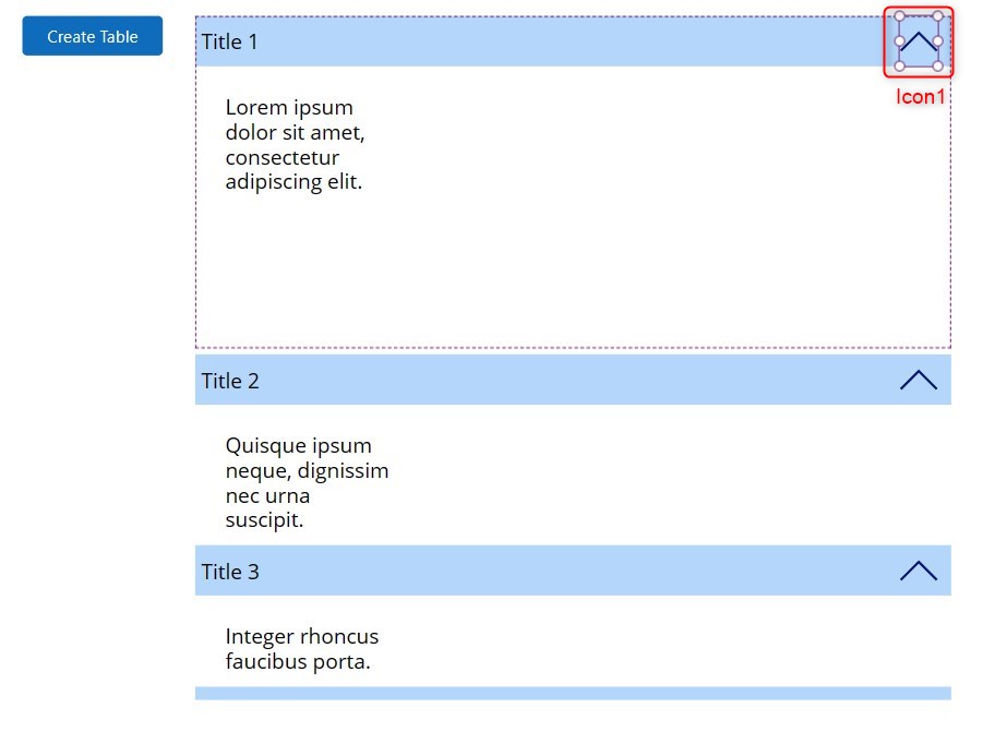
Step 6:
Insert an icon (up arrow) named Icon1 on the right side of Label1. Make the properties of Icon1 to be the following:
OnSelect property:
Patch(collItems,ThisItem,{Expand:!ThisItem.Expand})Rotation property:
If(ThisItem.Expand,0,180)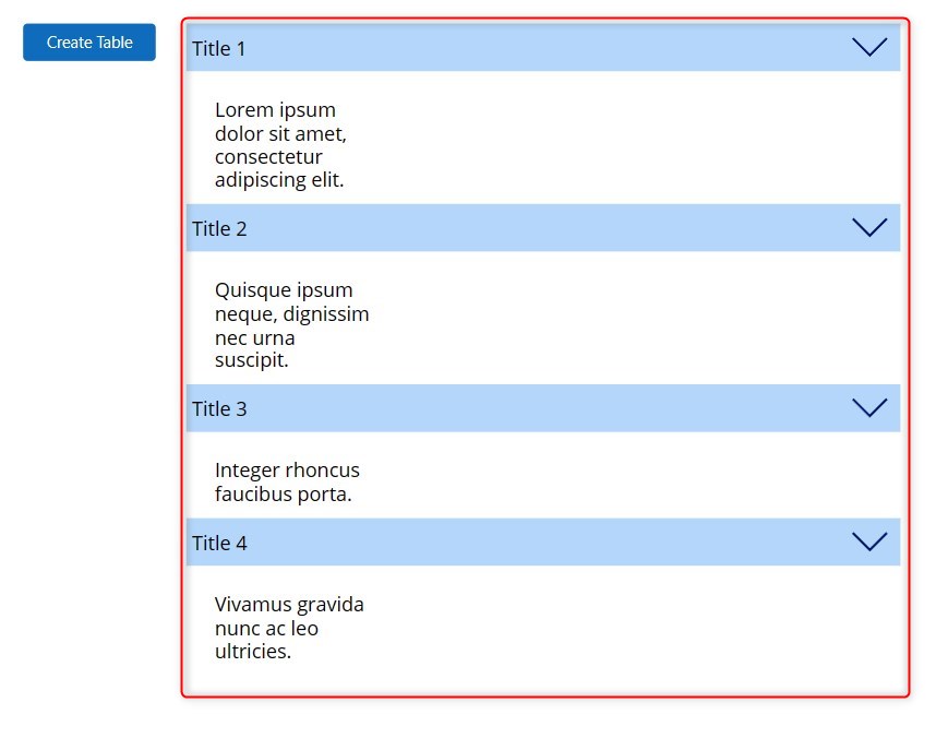
Step 7:
Make the gallery’s TemplateSize property into:
Label1.Height
Conclusion:
You have now successfully created a simple accordion. From here you can customize further as you wish.
Did this article help? Let us know how we can improve. Send us a message by clicking the “Contact Us” button below.
Article last updated on Apr 3, 2024
Need expert guidance on Power Apps?