Power Apps – How to Create Tabs
10 steps

Introduction:
This is the blueprint on how to create tabbed sections in Power Apps using Classic controls. Take note that in modern controls, there is a control named Tab list which is already complete in functionality but not too customizable in appearance.

Step 1:
Insert a button named Button1. Change the following properties:
Text property
"Tab 1"OnSelect property
UpdateContext({varActiveTab:Self.Text});RadiusBottomLeft, RadiusBottomRight, RadiusTopLeft, RadiusTopRight property
0Size property
If(varActiveTab=Self.Text,12,9)FocusedBorderThickness property
1Fill property
If(varActiveTab=Self.Text,RGBA(255, 255, 255, 1),RGBA(139, 154, 159, 1))Color property
If(varActiveTab=Self.Text,RGBA(0, 0, 0, 1),RGBA(214, 221, 224, 1))BorderThickness property
If(varActiveTab=Self.Text,1,0)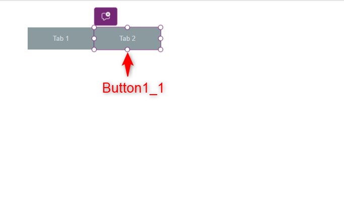
Step 2:
Copy Button1 and paste it on the canvas, you should now have Button1_1. Place it beside Button1. Change the following properties of Button1_1:
Text property
"Tab 2"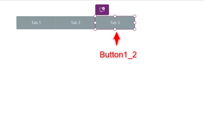
Step 3:
Copy Button1_1 and paste it on the canvas, you should now have Button1_2. Place it beside Button1_1. Change the following properties of Button1_2:
Text property
"Tab 3"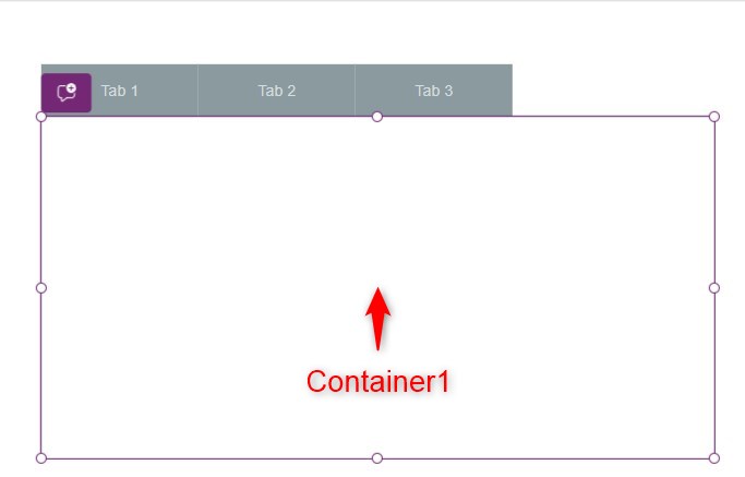
Step 4:
Insert a container named Container1. Place it below the buttons. Change the following properties
RadiusBottomLeft, RadiusBottomRight, RadiusTopLeft, RadiusTopRight property
0DropShadow property
DropShadow.NoneBorderThickness property
1BorderColor property
RGBA(214, 221, 224, 1)Fill property
RGBA(255, 255, 255, 1)
Step 5:
Insert a label inside Container1 named Label1. Change the following properties:
Text property
"Content 1"Align property
Align.Center
Step 6:
Copy Container1 and paste it in the canvas. You should have a duplicate copy named Container1_1 and a label named Label1_1 inside it. Put it over Container1. Change the following properties of Label1_1:
Text property
"Content 2"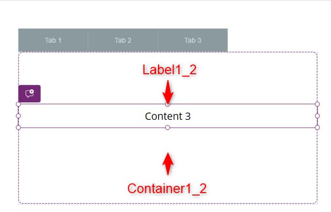
Step 7:
Copy Container1_1 and paste it in the canvas. You should have a duplicate copy named Container1_2 and a label named Label1_2 inside it. Put it over Container1_1. Change the following properties of Label1_2:
Text property
"Content 3"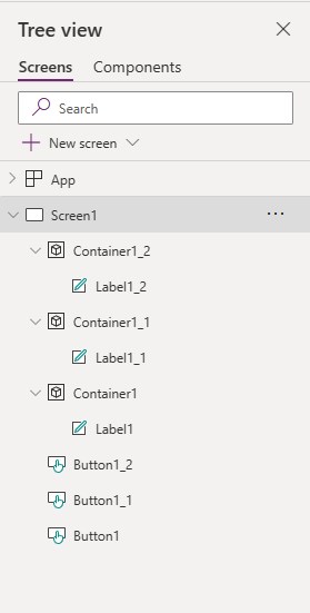
Review:
We should have a tree view that looks like what is in the image displayed.

Step 8:
Select Container1 from the Tree view. Change the following properties.
Visible property
varActiveTab="Tab 1"
Step 9:
Select Container1_1 from the Tree view. Change the following properties.
Visible property
varActiveTab="Tab 2"
Step 10:
Select Container1_2 from the Tree view. Change the following properties.
Visible property
varActiveTab="Tab 3"
Optional:
To have the effect of the illusion of having the tabs and the containers look like they are not separate controls, insert a rectangle named Rectangle1 and place it in between the tabs and the container. Change the following properties.
Fill property
RGBA(255, 255, 255, 1)Conclusion:
To test, hit Play and click on the tabs/buttons, you will see that the containers will show depending on which tab is selected.
Did this article help? Let us know how we can improve. Send us a message by clicking the “Contact Us” button below.
Article last updated on May 7, 2024
Need expert guidance on Power Apps?


